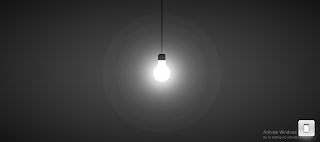
**Introduction to Building an Interactive Lamp using HTML, CSS, & JS:**
Creating an interactive lamp using HTML, CSS, and JavaScript is a fun and educational project that introduces fundamental web development concepts. In this project, we'll utilize these technologies to simulate a lamp that users can interact with. Let's break down the key aspects:
1. **HTML Structure:**
The HTML portion will define the structure of our lamp. This includes elements for the lamp base, lampshade, and any interactive components like buttons or sliders. HTML serves as the foundation, outlining the components that will make up our interactive lamp.
2. **CSS Styling:**
Cascading Style Sheets (CSS) will be employed to style the lamp and give it a visually appealing appearance. This involves setting colors, adjusting sizes, and ensuring that the lamp looks realistic or stylized based on your design preferences. CSS enhances the aesthetics of our lamp and contributes to its overall visual appeal.
3. **JavaScript Interactivity:**
JavaScript will play a crucial role in adding interactivity to our lamp. We can use JavaScript to handle events triggered by user interactions, such as clicking a button to turn the lamp on or off. Additionally, JavaScript can be utilized to manipulate the lamp's appearance dynamically, creating the illusion of light or adjusting brightness levels.
Building an interactive lamp provides hands-on experience with the core technologies of web development. It allows you to understand how HTML structures content, CSS enhances its presentation, and JavaScript adds behavior and interactivity. This project is not only a creative exercise but also a practical way to reinforce your understanding of web development concepts.
<->
start, add the following HTML codes to your index.html file.
<html lang="en">
<head>
<meta charset="UTF-8" />
<meta http-equiv="X-UA-Compatible" content="IE=edge" />
<meta name="viewport" content="width=device-width, initial-scale=1.0" />
<title>Light On and Off</title>
<link rel="stylesheet" href="style.css" />
</head>
<body>
<div class="light">
<div class="wire"></div>
<div class="bulb">
<span></span>
<span></span>
</div>
<div class="switch">
<div class="btn"></div>
</div>
</div>
<audio
src="https://www.fesliyanstudios.com/play-mp3/387"
id="audio"
autostart="false"
></audio>
<script src="app.js"></script>
</body>
</html>
Next, add the following CSS codes to your style.css
* {
margin: 0;
padding: 0;
box-sizing: border-box;
}
body {
display: flex;
justify-content: center;
align-items: center;
min-height: 100vh;
background: #222;
}
body.on {
background: radial-gradient(#555, #111);
}
.wire {
position: absolute;
left: calc(50% - 2px);
bottom: 50%;
width: 4px;
height: 60vh;
background: #000;
z-index: 1;
}
.bulb {
position: relative;
width: 80px;
height: 80px;
background: #444;
border-radius: 50%;
z-index: 2;
}
.bulb:before {
content: "";
position: absolute;
left: 22.5px;
top: -50px;
width: 35px;
height: 80px;
background: #444;
border-top: 30px solid #000;
border-radius: 10px;
}
body.on .bulb::after {
content: "";
position: absolute;
top: 50%;
left: 50%;
transform: translate(-50%, -50%);
width: 120px;
height: 120px;
background: #fff;
border-radius: 50%;
filter: blur(40px);
}
body.on .bulb {
background-color: #fff;
box-shadow: 0 0 50px #fff, 0 0 100px #fff, 0 0 150px #fff, 0 0 200px #fff,
0 0 250px #fff, 0 0 300px #fff, 0 0 350px #fff;
}
body.on .bulb::before {
background: #fff;
}
body.on .bulb span:nth-child(1) {
box-shadow: 20px 20px 0 10px #fff;
}
body.on .bulb span:nth-child(2) {
box-shadow: -20px 20px 0 10px #fff;
}
.bulb span:nth-child(1) {
position: absolute;
top: -16px;
left: -4px;
display: block;
width: 30px;
height: 30px;
background: transparent;
transform: rotate(342deg);
border-bottom-right-radius: 40px;
box-shadow: 20px 20px 0 10px #444;
}
.bulb span:nth-child(2) {
position: absolute;
top: -16px;
right: -4px;
display: block;
width: 30px;
height: 30px;
background: transparent;
transform: rotate(17deg);
border-bottom-left-radius: 40px;
box-shadow: -20px 20px 0 10px #444;
}
.switch {
position: absolute;
bottom: 50px;
right: 50px;
width: 80px;
height: 80px;
background: linear-gradient(#eee, #ccc, #eee);
border: 3px solid #000;
border-radius: 10px;
display: flex;
justify-content: center;
align-items: center;
box-shadow: gray 0px 20px 30px -10px;
}
.switch .btn {
position: relative;
width: 25px;
height: 40px;
background: linear-gradient(#777, #fff, #777);
border-radius: 6px;
border: 2px solid #000;
cursor: pointer;
}
.switch .btn::before {
content: "";
position: absolute;
top: 0;
left: 0;
width: 100%;
height: 85%;
background: linear-gradient(#fff, #fff);
border-radius: 4px;
}
.on .switch .btn::before {
top: 15%;
}
#audio {
display: none;
}
Next, add the following JS codes to your app.js
let btn = document.querySelector(".btn");
let body = document.body;
let audio = document.querySelector("#audio");
btn.addEventListener("click", () => {
body.classList.toggle("on");
audio.play();
});
