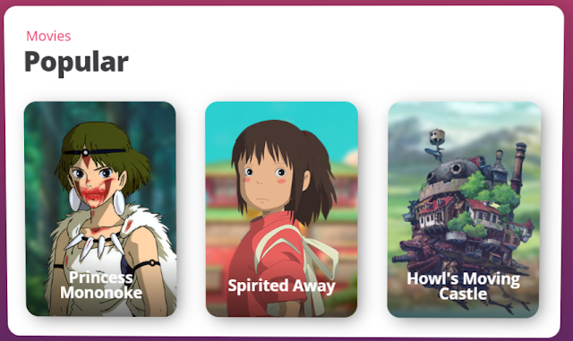
Welcome to the world of 3D CSS Parallax Depth Effect! Dive into an immersive experience where elements on your webpage come to life, creating depth and dimensionality. With just a few lines of CSS, you can transform your website into a dynamic environment that engages and captivates users. Join us as we explore the fascinating realm of 3D CSS Parallax Depth Effect and unlock a new dimension of creativity in web design.
Steps To Create 3D CSS Parallax Depth Effect
To create your weather app using HTML, CSS, and JavaScript, follow these step-by-step instructions:
- Create a folder. You can name this folder whatever you want, and inside this folder, create the mentioned files.
- Create an
index.html file. The file name must be index and its extension .html - Create a
style.css file. The file name must be style and its extension .css - Create a
script.js file. The file name must be script and its extension .js
To start, add the following HTML codes to your index.html file. This code includes a weather app header, input, button, and unordered list (ul) that are used as a placeholder for weather details. Later, using JavaScript, we’ll replace these placeholders with actual weather details.
<!DOCTYPE html>
<html lang="en">
<head>
<meta charset="UTF-8">
<meta name="viewport" content="width=device-width, initial-scale=1.0">
<title> 3D CSS Parallax Depth Effect</title>
<link rel="stylesheet" href="style.css">
</head>
<body>
<div class="cards">
<h3>Movies</h3>
<h1>Popular</h1>
<div class="card card__one">
<div class="card__bg"></div>
<img class="card__img" src="https://s3-us-west-2.amazonaws.com/s.cdpn.io/62105/3dr_mono.png" />
<div class="card__text">
<p class="card__title">Princess Mononoke</p>
</div>
</div>
<div class="card card__two">
<div class="card__bg"></div>
<img class="card__img" src="https://s3-us-west-2.amazonaws.com/s.cdpn.io/62105/3dr_chihiro.png" />
<div class="card__text">
<p class="card__title">Spirited Away</p>
</div>
</div>
<div class="card card__three">
<div class="card__bg"></div>
<img class="card__img" src="https://s3-us-west-2.amazonaws.com/s.cdpn.io/62105/3dr_howlcastle.png" />
<div class="card__text">
<p class="card__title">Howl's Moving Castle</p>
</div>
</div>
</div>
</body>
</html>
Next, add the following CSS codes to your style.css file to apply visual styling to your weather app. Now, if you load the web page in your browser, you will see the header at the top, a sidebar with input and buttons, and weather detail placeholders. You can customize this code to your liking by adjusting the color, font, size, and other CSS properties.
@import url('https://fonts.googleapis.com/css?family=Open+Sans:300,400,600,700,800');
html, body {
height: 100%;
}
body {
align-items: center;
background: #642b73;
background: linear-gradient(to bottom, #c6426e, #642b73);
display: flex;
font-family: 'Open Sans', sans;
justify-content: center;
overflow: hidden;
perspective: 1800px;
text-align: center;
margin: 0 20px;
}
h1 {
color: #3e3e42;
font-size: 32px;
font-weight: 800;
letter-spacing: -1px;
margin-bottom: 30px;
transform: translateZ(35px);
}
h3 {
color: #eb285d;
font-size: 16px;
margin-bottom: 6px;
transform: translateZ(25px);
}
.cards {
background: #fff;
border-radius: 15px;
box-shadow: 0px 10px 20px 20px rgba(0, 0, 0, 0.17);
display: inline-block;
padding: 30px 35px;
perspective: 1800px;
text-align: left;
transform-origin: 50% 50%;
transform-style: preserve-3d;
transform: rotateX(11deg) rotateY(16.5deg);
min-width: 595px;
}
.card {
border-radius: 15px;
box-shadow: 5px 5px 20px -5px rgba(0, 0, 0, 0.6);
display: inline-block;
height: 250px;
overflow: hidden;
perspective: 1200px;
position: relative;
transform-style: preserve-3d;
transform: translatez(35px);
transition: transform 200ms ease-out;
width: 175px;
text-align: center;
}
.card:not(:last-child) {
margin-right: 30px;
}
.card__img {
position: relative;
height: 100%;
}
.card__bg {
bottom: -50px;
left: -50px;
position: absolute;
right: -50px;
top: -50px;
transform-origin: 50% 50%;
transform: translateZ(-50px);
z-index: 0;
}
.card__one .card__img {
top: 14px;
right: -10px;
height: 110%;
}
.card__one .card__bg {
background: url('https://s3-us-west-2.amazonaws.com/s.cdpn.io/62105/3dr_monobg.jpg') center / cover no-repeat;
}
.card__two .card__img {
top: 25px;
}
.card__two .card__bg {
background: url('https://s3-us-west-2.amazonaws.com/s.cdpn.io/62105/3dr_spirited.jpg') center / cover no-repeat;
}
.card__three .card__img {
top: 5px;
left: -4px;
height: 110%;
}
.card__three .card__bg {
background: url('https://s3-us-west-2.amazonaws.com/s.cdpn.io/62105/3dr_howlbg.jpg') center / cover no-repeat;
}
.card__text {
align-items: center;
background: linear-gradient(to bottom, rgba(0, 0, 0, 0) 0%, rgba(0, 0, 0, 0.55) 100%);
bottom: 0;
display: flex;
flex-direction: column;
height: 70px;
justify-content: center;
position: absolute;
width: 100%;
z-index: 2;
}
.card__title {
color: #fff;
font-size: 18px;
font-weight: 700;
padding: 0 10px;
margin-bottom: 3px;
}
.notice {
background: gold;
border-top-left-radius: 6px;
bottom: 0;
font-family: monospace;
font-size: 14px;
padding: 8px 10px;
position: absolute;
right: -20px;
}
.twitter__link {
cursor: pointer;
position: absolute;
right: -10px;
top: 12px;
z-index: -1;
background: #00aced;
border-radius: 20px;
height: 30px;
text-decoration: none;
padding-right: 10px;
justify-content: space-between;
font-weight: 600;
display: flex;
align-items: center;
color: #fff;
font-size: 14px;
width: 74px;
opacity: 0.4;
}
.twitter__link:hover {
opacity: 1;
}
.twitter__icon {
height: 30px;
}
Finally, add the following JavaScript code to your script.js file. This script code will make your weather app functional, which means now you can get a 5-day weather forecast for any city or your current location.
const cards = document.querySelector(".cards");
const images = document.querySelectorAll(".card__img");
const backgrounds = document.querySelectorAll(".card__bg");
const range = 40;
// const calcValue = (a, b) => (((a * 100) / b) * (range / 100) -(range / 2)).toFixed(1);
const calcValue = (a, b) => (a/b*range-range/2).toFixed(1) // thanks @alice-mx
let timeout;
document.addEventListener('mousemove', ({x, y}) => {
if (timeout) {
window.cancelAnimationFrame(timeout);
}
timeout = window.requestAnimationFrame(() => {
const yValue = calcValue(y, window.innerHeight);
const xValue = calcValue(x, window.innerWidth);
cards.style.transform = `rotateX(${yValue}deg) rotateY(${xValue}deg)`;
[].forEach.call(images, (image) => {
image.style.transform = `translateX(${-xValue}px) translateY(${yValue}px)`;
});
[].forEach.call(backgrounds, (background) => {
background.style.backgroundPosition = `${xValue*.45}px ${-yValue*.45}px`;
})
})
}, false);
Demo and Step By Step
Conclusion
the 3D CSS Parallax Depth Effect offers an exciting avenue for enhancing web design and user engagement. By leveraging the power of CSS, developers can create immersive experiences that captivate users and bring depth to their websites. Through careful implementation and experimentation, this effect can add a unique touch to any project, leaving a lasting impression on visitors. As technology continues to evolve, the possibilities for creativity within web design are endless. Embrace the 3D CSS Parallax Depth Effect and take your websites to new heights of interactivity and visual appeal.
Source code
