Internet Speed Test UI With JavaScript

codinglabsolution

   Embark on a coding adventure! Follow our guide to build Internet Speed Test UI using HTML, CSS, and JavaScript. Unleash your creativity in web development.


Internet Speed Test UI With JavaScript


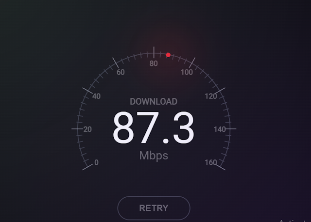
Welcome to our Internet Speed Test UI powered by JavaScript. Quickly assess your connection speed with our intuitive interface, delivering real-time results for a seamless user experience.


Source Code

Step 1 (HTML Code):


Sure, here's a breakdown of the provided HTML code:


1. `<!DOCTYPE html>`: Declaration of the document type and version of HTML being used.


2. `<html lang="en">`: The root element of the HTML document, specifying the language of the content as English.


3. `<head>`: Contains meta-information about the HTML document, such as character encoding, viewport settings, and the document title.


   - `<meta charset="UTF-8">`: Defines the character encoding for the document as UTF-8.


   - `<meta name="viewport" content="width=device-width, initial-scale=1.0">`: Sets the viewport width to the device width and initial zoom level to 1.0, ensuring proper rendering on various devices.


   - `<title>Internet Speed Test UI With JavaScript</title>`: Sets the title of the document.


   - `<link rel="stylesheet" href="style.css">`: Links an external CSS stylesheet file named "style.css" to the HTML document for styling purposes.


4. `<body>`: Contains the content of the HTML document visible to users.


   - `<section class="container">`: Defines a section with the class "container" to hold the internet speed test UI elements.


     - `<div class="speedometer">`: Represents the main container for the speedometer UI.


       - Various child elements inside "speedometer" div, including rings, digits, details, progress bar, retry button, and footer, each serving different purposes in the speedometer UI.


   - `<script src="script.js"></script>`: Links an external JavaScript file named "script.js" to the HTML document for scripting functionality.


5. `<div class="overlay"></div>`: An empty div element with the class "overlay", possibly used for overlay effects or modal content in CSS or JavaScript.

<!DOCTYPE html>
<html lang="en">
<head>
    <meta charset="UTF-8">
    <meta name="viewport" content="width=device-width, initial-scale=1.0">
    <title>Internet Speed Test UI With JavaScript</title>
    <link rel="stylesheet" href="style.css">
</head>
<body>
    <section class="container">
        <div class="speedometer">
          <div class="inner-ring"></div>
          <div class="outer-ring">
            <span class="tick"></span>
            <span class="tick"></span>
            <span class="tick"></span>
            <span class="tick"></span>
            <span class="tick"></span>
            <span class="tick"></span>
            <span class="tick"></span>
            <span class="tick"></span>
            <span class="tick"></span>
            <span class="tick"></span>
            <span class="tick"></span>
            <span class="tick"></span>
            <span class="tick"></span>
            <span class="tick"></span>
            <span class="tick"></span>
            <span class="tick"></span>
            <span class="tick"></span>
            <span class="tick"></span>
            <span class="tick"></span>
            <span class="tick"></span>
            <span class="tick"></span>
            <span class="tick"></span>
            <span class="tick"></span>
            <span class="tick"></span>
            <span class="tick"></span>
            <span class="tick"></span>
            <span class="tick"></span>
            <span class="tick"></span>
            <span class="tick"></span>
            <span class="tick"></span>
            <span class="tick"></span>
            <span class="tick"></span>
            <span class="tick"></span>
            <span class="tick"></span>
            <span class="tick"></span>
            <span class="tick"></span>
            <span class="tick"></span>
            <span class="tick"></span>
            <span class="tick"></span>
            <span class="tick"></span>
            <span class="tick"></span>
            <span class="tick"></span>
            <span class="tick"></span>
            <span class="tick"></span>
            <span class="tick"></span>
            <span class="tick"></span>
            <span class="tick"></span>
            <span class="tick"></span>
            <span class="tick"></span>
          </div>
          <div class="digit-ring">
            <span class="digit">0</span>
            <span class="digit">20</span>
            <span class="digit">40</span>
            <span class="digit">60</span>
            <span class="digit">80</span>
            <span class="digit">100</span>
            <span class="digit">120</span>
            <span class="digit">140</span>
            <span class="digit">160</span>
          </div>
          <div class="details">
            <p class="label">Download</p>
            <p class="speed">87.3</p>
            <p class="unit">Mbps</p>
          </div>
          <div class="progress"></div>
          <button class="retry-button">Retry</button>
          <footer>
            <div class="stat">
              <label>Ping</label>
              <p>2ms</p>
            </div>
            <div class="stat">
              <label>Upload</label>
              <p>67.7 Mbps</p>
            </div>
          </footer>
        </div>
        <div class="overlay"></div>
      </section>
      <script src="script.js"></script>
</body>
</html>

Step 2 (CSS Code):


1. Universal Selector Reset:

   - `*, *::before, *::after`: Resets margin to 0 for all elements, ensuring consistent spacing.


2. Body Styling:

   - `body`: Sets the height to 100% of the viewport height and centers its content using CSS grid.


3. Container Styling:

   - `.container`: Defines the main container for the speed test UI.

   - Sets width and height to create a square layout.

   - Applies font family, line height, color, and disables text selection.

   - Adds a box shadow for a 3D effect.


4. Background Overlays:

   - Uses pseudo-elements (`::before` and `::after`) to create gradient overlays for the background, adding depth and visual interest to the UI.


5. Speedometer Elements Styling:

   - `.inner-ring` and `.outer-ring`: Define the inner and outer rings of the speedometer.

   - `.digit-ring`: Positions and styles the ring containing speed digits.

   - `.tick`: Styles ticks around the speedometer ring.

   - `.digit`: Styles the digits displayed on the ring.

   - `.details`: Styles the section displaying speed details.

   - `.progress`: Styles the progress indicator for the speed test.


6. Retry Button Styling:

   - `.retry-button`: Styles the retry button for restarting the speed test.

   - Applies border, font properties, and transitions for hover effects.


7. Footer Styling:

   - `footer`: Styles the footer section containing additional statistics.

   - Uses flexbox for layout and applies padding and position properties.


8. Statistics Styling:

   - `.stat`: Styles individual statistics displayed in the footer.

   - Defines width, padding, text alignment, and border for separation.

   - `.label` and `p`: Styles labels and values within the statistics.


Overall, the CSS code creates a visually appealing and functional internet speed test UI with various styling elements and overlays to enhance the design.


*,
*::before,
*::after {
  margin: 0;
}

body {
  height: 100vh;
  margin: 0;
  display: grid;
  place-items: center;
}

.container {
  width: 48rem;
  height: 48rem;
  position: relative;
  font-family: 'Roboto', sans-serif;
  line-height: 1;
  color: #666;
  user-select: none;
  background-color: #000;
  box-shadow: 0 0 10rem rgba(0, 0, 0, 0.75);
}

.container::before {
  content: '';
  position: absolute;
  inset: 0;
  background-image: radial-gradient(circle at top left, #fff, transparent);
  opacity: 0.12;
}

.overlay {
  pointer-events: none;
}

.overlay::before,
.overlay::after {
  content: '';
  position: absolute;
  inset: 0;
}

.overlay::before {
  background-image: radial-gradient(circle at top left, #25fabb, transparent);
  opacity: 0.04;
}

.overlay::after {
  background-image: radial-gradient(circle at bottom right, #874bd7, transparent);
  opacity: 0.2;
}

.inner-ring {
  width: 21rem;
  height: 21rem;
  position: absolute;
  top: calc(50% - 12.5rem);
  left: calc(50% - 10.5rem);
}

.inner-ring::before,
.inner-ring::after {
  content: '';
  position: absolute;
  inset: 0;
  border: 2px solid transparent;
  border-top: 2px solid #3b3d45;
  border-right: 2px solid #3b3d45;
  border-radius: 50%;
}

.inner-ring::before {
  transform: rotate(-75deg);
}

.inner-ring::after {
  transform: rotate(-15deg);
}

.outer-ring {
  width: 32rem;
  height: 32rem;
  position: absolute;
  top: calc(50% - 18rem);
  left: calc(50% - 16rem);
  border-radius: 50%;
}

.digit-ring {
  position: absolute;
  top: calc(50% - 2rem);
  left: 50%;
}

.tick {
  width: 0.8rem;
  border-top: 2px solid #3b3d45;
  position: absolute;
  top: calc(50% - 0.1rem);
  left: calc(50% - 0.4rem);
}

.tick:nth-child(6n+1) {
  width: 1.6rem;
  left: calc(50% - 0.8rem);
  border-color: #787a81;
}

.digit {
  width: 2rem;
  height: 2rem;
  position: absolute;
  top: calc(50% - 1rem);
  left: calc(50% - 1rem);
  font-weight: bold;
  text-align: center;
  line-height: 2rem;
}

.details {
  display: flex;
  flex-direction: column;
  justify-content: center;
  align-items: center;
  width: 21rem;
  height: 21rem;
  position: absolute;
  top: calc(50% - 12.5rem);
  left: calc(50% - 10.5rem);
}

.label {
  font-size: 1.2rem;
  font-weight: bold;
  text-transform: uppercase;
}

.speed {
  font-size: 6rem;
  color: #fff;
}

.unit {
  font-size: 1.6rem;
}

.progress {
  width: 21rem;
  height: 21rem;
  position: absolute;
  top: calc(50% - 12.5rem);
  left: calc(50% - 10.5rem);
  border-radius: 50%;
  transition: all 50ms;
}

.progress::before {
  content: '';
  position: absolute;
  top: -0.2rem;
  left: calc(50% - 0.3rem);
  width: 0.6rem;
  height: 0.6rem;
  border-radius: 50%;
  background-color: #f1252e;
  box-shadow: 0 0 6rem 2rem rgba(241, 37, 46, 0.35);
}

.retry-button {
  width: 10rem;
  border: 2px solid #3b3d45;
  appearance: none;
  position: absolute;
  left: calc(50% - 5rem);
  bottom: 13.5rem;
  font-size: 1.2rem;
  font-weight: bold;
  text-align: center;
  text-transform: uppercase;
  line-height: 3rem;
  color: #666;
  border-radius: 3rem;
  background-color: transparent;
  cursor: pointer;
  outline: none;
  transition: background-color 250ms ease-out;
}

.retry-button:hover,
.retry-button:focus {
  background-color: rgba(59, 61, 69, 0.15);
}

footer {
  display: flex;
  justify-content: center;
  padding: 3.5rem 0;
  position: absolute;
  top: auto;
  left: 0;
  right: 0;
  bottom: 0;
}

.stat {
  flex-grow: 1;
  width: 0;
  padding: 1rem 0;
  text-align: center;
}

.stat:not(:last-child) {
  border-right: 2px solid rgba(255, 255, 255, 0.05);
}

.stat label {
  display: block;
  margin-bottom: 0.75rem;
  font-size: 1.2rem;
  font-weight: bold;
  text-transform: uppercase;
}

.stat p {
  font-size: 1.4rem;
  color: #fff;
}

Step 3 (JavaScript Code):


This JavaScript code controls the dynamic behavior of the internet speed test UI. Here's a breakdown:


1. Querying DOM Elements:

   - `$ticks`, `$digits`, `$details`, and `$progress` are selected using `document.querySelectorAll()` and `document.querySelector()` to reference various elements in the HTML.


2. Constants and Functions:

   - `outerRingRadius` and `digitRingRadius` store the radius values for the outer and digit rings, respectively.

   - `deg2rad()` and `rad2deg()` functions convert angles between degrees and radians.


3. Styling Tick Marks and Digits:

   - Loops through each tick and digit element, calculates their positions using trigonometric functions, and applies the transformation using CSS `transform` property to position them in a circular pattern.


4. Setting Speedometer Value:

   - Defines parameters for animation frames and maximum speed values.

   - `setStatValue()` function updates the speedometer value based on the given value, adjusting the rotation angle of the progress indicator.


5. Updating Speed Details:

   - `updateDetails()` function increments the speed value gradually over multiple animation frames, simulating a smooth increase.

   - Uses `setTimeout()` to repeatedly call itself until the maximum value is reached.


6. Retry Button Functionality:

   - Adds an event listener to the retry button to reset the speed value to zero and restart the update process when clicked.


Overall, this code provides the functionality to animate the speedometer and display dynamic speed values, enhancing the user experience of the internet speed test UI.
const $ticks = document.querySelectorAll('.tick');
const $digits = document.querySelectorAll('.digit');
const $details = document.querySelector('.details');
const $progress = document.querySelector('.progress');

const outerRingRadius = 164;
const digitRingRadius = 145;

function deg2rad(angle) {
  return angle * (Math.PI / 180);
}

function rad2deg(angle) {
  return angle * (180 / Math.PI);
}

$ticks.forEach(($tick, i) => {
  const angle = 210 - i * 5;
  const theta = deg2rad(angle);
  const radius = outerRingRadius + (i % 6 ? 0 : 4);
  const x = Math.cos(theta) * radius;
  const y = Math.sin(theta) * -radius;

  $tick.style.transform = `translate(${x}px, ${y}px) rotate(${-angle}deg)`;
});

$digits.forEach(($digit, i) => {
  const angle = 210 - i * 30;
  const theta = deg2rad(angle);
  const x = Math.cos(theta) * digitRingRadius;
  const y = Math.sin(theta) * -digitRingRadius;

  $digit.style.transform = `translate(${x}px, ${y}px)`;
});

const frameCount = 100;
const frameInterval = 50;
const digitValueMax = 160;
const statValueMax = 87.3;
const statValueInterval = statValueMax / frameCount;
let statValueCurrent = 0;

function setStatValue(value) {
  const angle = -120 + 240 * (value / digitValueMax);
  $progress.style.transform = `rotate(${angle}deg)`;

  $details.querySelector('.speed').innerText = value;
}

function updateDetails() {
  if (statValueCurrent.toFixed(1) > statValueMax) {
    return;
  }
  setStatValue(statValueCurrent.toFixed(1));
  statValueCurrent += statValueInterval;
  setTimeout(updateDetails, frameInterval);
}

updateDetails();

document.querySelector('.retry-button')
.addEventListener(
  'click',
  () => {
    statValueCurrent = 0;
    updateDetails();
  },
);

Source Code: Download Files


Conclusion:


In conclusion, the Internet Speed Test UI created with JavaScript offers a visually engaging and interactive experience for users to measure their connection speed. Through dynamic animation and smooth transitions, users can easily gauge their internet speed in real-time. The combination of CSS styling and JavaScript functionality ensures a seamless and intuitive interface, enhancing the overall user experience. With the ability to retry the test and observe detailed statistics, this UI provides valuable insights into internet performance while maintaining a modern and stylish design.

Tags: #JavaScript #WebDevelopment #UserInterface #InternetSpeed #UIUX #FrontEndDevelopment #WebDesign #CSS #PerformanceTesting #WebApps

إرسال تعليق

ملفات تعريف الارتباط
نستخدم ملفات تعريف الارتباط (Cookies) لفهم كيفية استخدامك لموقعنا وتحسين تجربتك في المحتوى والإعلانات. باستمرارك في تصفح الموقع، فإنك توافق على استخدامنا لملفات تعريف الارتباط وفقًا لسياسة الخصوصية لدينا.
أُووبس!
يبدو أن هناك خطأ ما في اتصالك بالإنترنت. يرجى الاتصال بالإنترنت وبدء التصفح مرة أخرى.
AdBlock Detected!
We have detected that you are using adblocking plugin in your browser.
The revenue we earn by the advertisements is used to manage this website, we request you to whitelist our website in your adblocking plugin.
Site is Blocked
Sorry! This site is not available in your country.